← All Blogs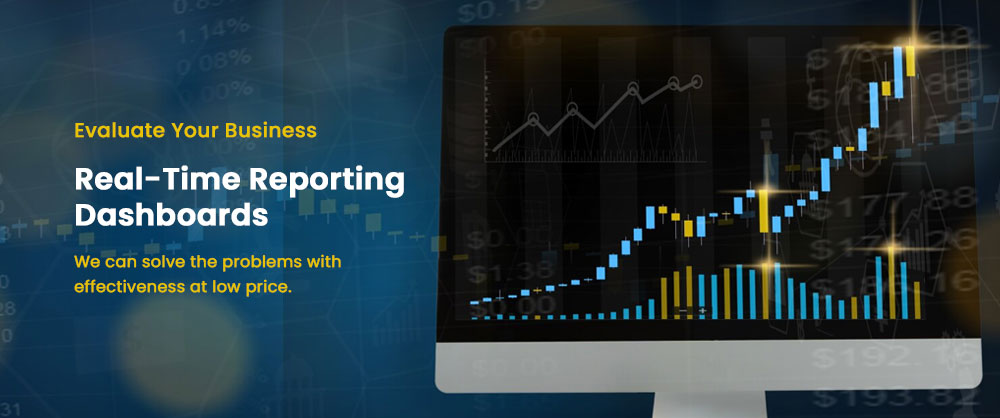
Blogs
From Data to Decisions: Building Real-Time Dashboards That Drive Action
7/3/2025
Quick Answer
Real-time dashboards drive action when built around specific decisions (not raw data), using tools like Looker Studio, Power BI, or Tableau, with automated refresh and clear, actionable visual design.
In today's fast-paced digital environment, data is everywhere, but action is everything. Businesses aren't short on reports; they're short on insights that lead to results. That's where real-time dashboards come in — not just as a way to visualize data, but as tools to drive smarter, faster decisions.
Why Real-Time Dashboards Matter More Than Ever
The age of static, weekly reports is over. Decision-makers need to respond to trends as they happen. Real-time dashboards help you spot anomalies before they become problems, monitor campaign performance minute-by-minute, align teams with up-to-date metrics, and empower fast, data-driven decisions.
Step 1: Start with the Questions, Not the Data
Before opening Looker Studio or Power BI, ask: what decisions will this dashboard help us make, who is the primary audience, and what KPIs matter most right now? A real-time dashboard isn't a data dump — it should focus only on the information that prompts action.
Step 2: Choose the Right Tool for Your Needs
Looker Studio (formerly Google Data Studio) is best for marketing and web analytics dashboards — free, cloud-based, and easy to integrate with Google Analytics, Google Ads, BigQuery, and Sheets. Microsoft Power BI is best for enterprise-level reporting — powerful modeling and DAX formulas, works seamlessly with Azure, Excel, and SQL databases. Tableau is best for visual storytelling and data exploration — rich interactivity and advanced visualizations with live connections to databases or APIs. Bonus tools: BigQuery, Zapier/Make, Supermetrics, Fivetran or Stitch.
Step 3: Design for Clarity and Action
Use hierarchy — put the most important KPIs at the top. Color with purpose — red for alert, green for goal met, blue for neutral. Limit distractions and avoid excessive charts and filters. Label everything with tooltips or notes for context. Show trends, not just numbers.
Step 4: Automate and Update in Real-Time
The value of a dashboard drops instantly if the data is stale. Set auto-refresh intervals, connect live data sources (Google Ads, Shopify, Salesforce), and configure alerts and triggers for out-of-threshold performance.
Step 5: Make It Actionable
A dashboard should lead to action. Ask: can a team member make a decision after viewing this, are there alerts or color cues when something's off, is it easy to drill down? Examples of action-oriented dashboards: a Marketing ROI Tracker that flags channels falling below ROAS threshold, a Sales Pipeline Monitor that highlights stuck reps or deals, a Customer Support Heatmap that shows spikes in tickets by category or region.
Final Thoughts
A dashboard isn't just a report, it's a decision-making tool. When built right, real-time dashboards align teams, spotlight what matters, and turn raw data into real momentum. The winning formula: ask the right questions, use the right tools, design for clarity, and enable action.